How Interface Layouts Guide Decision Patterns Among UK Multi-Game Users
Eden Richter · Nov 3, 2026
How Interface Layouts Guide Decision Patterns Among UK Multi-Game Users
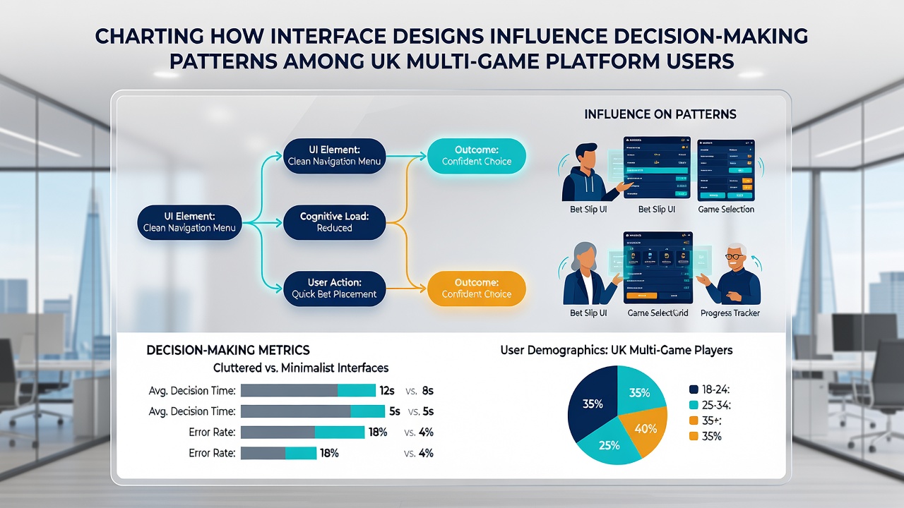
Interface designs on UK multi-game platforms shape how users select games, adjust stakes, and manage sessions, with layout elements directing attention toward specific options while data from regulatory reports and academic studies track these patterns across desktop and mobile formats. Researchers have documented how navigation menus, color contrasts, and prompt placements lead to measurable shifts in play duration and game type preferences, particularly as hybrid bingo and slot environments expand in late 2026.
Navigation Structures and Initial Choices
Platform menus often position high-engagement titles at the top or center of screens, and studies indicate users select featured games at rates up to 40 percent higher than those buried in lower rows according to industry analytics compiled by the European Gaming and Betting Association. Scroll depth metrics reveal that participants rarely reach the third page of results before committing to an option, which means carousel rotations adn default filters exert strong influence over early decisions. Observers note that when platforms introduce category tabs labeled by theme rather than game mechanics, users migrate toward themed bundles more frequently than standalone selections, creating clustered activity around seasonal promotions running through November 2026.
Color, Prompts, and Stake Adjustments
Button hues and size variations draw focus to deposit or spin actions, while neutral palettes for limit-setting tools receive less immediate interaction. Evidence from a Monash University analysis of digital interfaces shows that warm accent colors increase quick-stake selections by prompting faster clicks, whereas cool tones around session timers correlate with extended pauses before continued play. Pop-up reality checks positioned at fixed intervals interrupt flow differently than those triggered by spend thresholds, and platform operators report varied compliance rates depending on whether these alerts use full-screen overlays or subtle side banners.
Mobile Layouts Versus Desktop Patterns
Touchscreen adaptations compress multiple game previews into single views, and swipe mechanics encourage rapid browsing that favors shorter sessions compared with desktop users who maintain longer open tabs. Data compiled across multiple platforms shows mobile participants switch between bingo rooms and slot lobbies more often, yet complete fewer individual rounds per visit because thumb-friendly controls prioritize speed over deliberation. Those who study cross-device behavior observe that portrait orientation increases visibility of progressive jackpot meters, which in turn elevates selection rates for linked games during peak evening hours.
Bonus Displays and Term Visibility
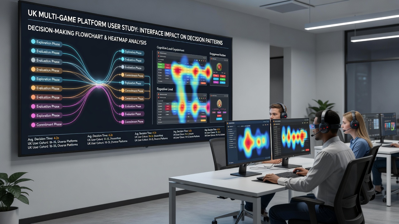
Wagering requirement disclosures appear in smaller fonts or expandable sections on many sites, and usage logs indicate users accept offers without expanding those details at higher rates than when terms occupy prominent static panels. Platform tests conducted in 2025 and carried forward into 2026 demonstrate that animated bonus meters raise initial deposit volumes, although subsequent play patterns remain consistent with baseline engagement once the promotional period ends. External reviews from research institutions in Canada highlight how default auto-play toggles, when placed near stake controls, sustain longer sequences before manual intervention occurs.
Real-Time Feedback and Session Management
Live balance counters and win animations update continuously, directing attention back to active games rather than exit options, while separate tabs for responsible gambling tools sit outside primary flows. Patterns tracked by academic groups show that platforms embedding quick-access deposit buttons alongside running totals record elevated top-up frequency during single sessions. In contrast, interfaces that surface withdrawal pathways within the same navigation layer see users initiate cash-outs earlier in their activity cycles.
Conclusion
Interface components across UK multi-game platforms continue to evolve in response to participation data gathered through 2026, with navigation hierarchies, visual cues, and prompt timing each contributing to observable differences in how users allocate time and funds. Continued monitoring by independent research bodies and cross-regional organizations provides ongoing records of these influences, allowing operators and regulators to refine layouts while maintaining transparency around decision pathways.